My latest art print, Faded, was an interesting process and didn’t end up as I expected it to.
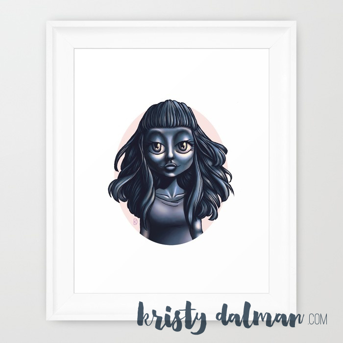
When I drew the line art, I knew that I wanted to do a very dramatic lighting with this piece, her sultry expression demanded it.
On my other pieces I started out with a base color in the area I was working on and build up my colors, this was similar but instead of building up highlights, shadows and midtones on my base, the entire base was my shadow. I worked in a monotone of navy blue thru a pale blue, on top I added highlights in yellows and greens. She turned out very well but with the dark background, though it hit the drama-mark, it made it hard to see.
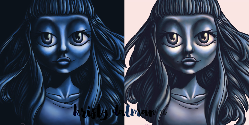
You can see what I mean in the before and after.
If you’re a photoshop person you’ll know what I mean… I took the final image into the Curves tool and tweaked hue and saturation, badaboom, badabing, we have the final image! Thru those tweaks I gave her a more vintage look, the navys have bit of brown tint, the highlights a bit of pink and purple, the midtones a little greyer.
She became Faded.
See? Very cerebral 😉
You can pick Faded up on Society6 as a print, tote bag, pillow, coffee mug, all sorts of things actually. I’d also love to see you join my Patreon, my patrons received the line art for Faded this month, which won’t be available elsewhere… ever. March will enjoy some more exclusives and all the goodies.



craftylittlecreations says:
utterly cool!