
Over a series of posts, that I’ll be doing on opposite weeks of my Color Swatch series, I’m going to be helping you achieve better coloring by being more knowledgeable about using a Light Source in your coloring. We’re going to take it in small steps so I hope you’ll join me and follow along…
If you’re new to coloring, Light Source might not be a term you’re familiar with…
Light Source is the idea of knowing from what direction and in what way Light hits an object to be able to accurately render shadows and highlights in a way that gives 2-dimensional objects a 3-dimensional appearance.
There are many components to a Light Source and many different types of Light Sources so count that as a broad definition. The goal of using a Light Source in your coloring is to give a 2D image the look of having shape, volume, dimension and depth… looking 3D. In coloring we use contrast and color to give 2D objects the illusion of shape.
Terms Defined
To make that contrast and to make that circle into a sphere we are using a Light Source. When we talk about the color we will be talking about 3 different areas so let’s define them:
Highlight: the area where light most strongly hits an object, it is the lightest part of an object
Midtone: the main color of your object, this area is neither highlight nor shadow
Shadow: the area where light does not reach, the darkest area of an object
In later posts I’ll add in Cast Shadows but let’s keep it simple for now. These areas all need to be added in the right places to get the 3-dimensional look that we’re after. The Midtone color is the most important as it is the “actual” color of your object. If light came from everywhere at once, so everything was equally lit, the Midtone would be the color we saw. Count it as your starting point that you can then choose your Highlight and Shadow from.
Starting Small
The first trick in getting a handle on light source is to train your brain to see the objects in a 3D way versus a 2D way. For example, check out this circle…

Or should we say Sphere :DD
Just that small change in thinking takes your brain from the flat circle to a 3-dimensional sphere (as I represented with a wired sphere that I then colored). Tricky, eh? Almost every part of an image can be broken down into simple shapes that give you a great starting point when coloring. Spheres, even ones a little more oval shaped, and Cylinders are some of the most common ones you’ll see in coloring character images.
Something to work on
To get in the 3D frame of mind, I want you to take an image and using a colored pen (so you can see your work afterwards), break an image down into its basic 3-Dimensional shapes by drawing them over your image. In the end you’ll come out with something like this…
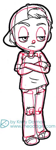
See how this gives you a better idea of the shapes involved? With practice this will be second nature and you won’t have to or need to do this.
In the next installment we’ll go over seeing a basic light source on those objects.






Lenny says:
Totally helpful!!
GREAT post! Can’t wait for the next one!!
Lots of struggles with the light source thingy … 🙁
🙂 🙂
MelissaO says:
Very informative! The light source can be confusing so the extra clarification will be great.
Shazza says:
really interesting, must try that x
JudyBags says:
I feel like I am back in art class again. Great information! Thanks!!
Kristy says:
as long as that’s a good thing lol 🙂
JudyBags says:
YES! That’s a great thing…loved my art classes!
Charity Chamberlain says:
Can’t wait for the rest of this! Light source is something that has been puzzling me when I look at everyone’s coloring because what I was taught in Art and painting classes is nothing like what I am mostly seeing in the “crafting coloring world”. So as I am coloring my images I am struggling because I’m not sure whether to follow what I was taught or to color like other crafters. So basically, I’ve been coloring my images with half of what I learned in my classes along with half of what I’ve seen which has been driving me bonkers! So I am SUPER excited for this!
Kristy says:
I think a lot of people don’t have a clear idea about Light Source or aren’t using it. Ive also seen tutorials out there that are sharing misinformation so thats not helpful for people either. I’d go with what you learned in art class and not worry about what others are up to 🙂
Patricia says:
Well I am bowing down to you , my friend! You are amazing with EVERYTHING! If I ever get the idea to color, I know who will teach me
Heather North says:
Thank you for putting this together for us! It makes so much sense when you break it down the way you have.
Kristy says:
I’m glad that’s helpful! I seems less intimidating to shade a basic shape than to shade an arm or a leg 🙂
Linda Compton says:
Thank you Kristy. I am going to follow your lead and give this a try. I have been working on my lightsource. I start out remember it, but some times I don’t follow through the entire image. I am learning the more I practice the more I remember it. Breaking it up into small pieces is a great idea.
Alexis says:
Sooooo helpful! I love all these tutes you’re doing!
Light Source Basics, Part 2: Linear Light | The Odd Girl says:
[…] In the last post I defined some basic terms and challenged you to break down your images into simple… If you’re just joining in here, each post is going to build upon the last one so hop back and give a read then come on back. […]
Janeen says:
Thanks for creating this tutorial for us! I’m going to be double stamping/printing and fleshing this technique out. I do tend to confuse myself partway through my colouring, which frustrates me no end. I wish I’d studied Art at school rather than dropping it for an extra language. Now I’m off to lesson 2!!