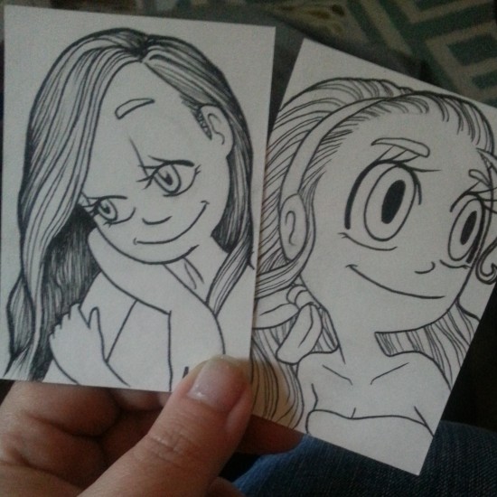
I have quite a few pieces from my “pencil only” days that I’d love to see in color but cringe at the thought of coloring the original. This past weekend I needed some calm zen time (why is a whole other story) so I had the idea to trace the basic outline of a piece I did in 2009 that fell into the color-cringe category and had at it with my copics, so we have a new coloring of a throwback pencil piece.
I first tried on marker specific paper, not Xpress It but the art pad from Michaels. It was thin so traced easily but its non-bleed AND thin… which caused the ink to pretty much sit on top and you couldn’t layer for nothing.
Next I tried a medium surface drawing paper I had, thicker than a sketch paper but not as thick as a bristol, this had much better results! I can’t say I’m a fan on the rougher texture of the paper so I’ll be giving bristol a go next time.
I had been admiring the art of a talented man on Instagram, Chris Tullis (@christopherkerry on IG), and all the realistic colors he gets in his skin so I decided to experiment with that. My poor fam didn’t notice, luckily, my covert staring to make some observations as I went along. They’d understand but it would be awkward to explain either way… “yeah, I was just staring at the skin on your face to check out the colors you got going on… um… yeah…” The second pic on the slideshow is much better than the 3rd to show the results, I think the dark hair made my cell phone not the greatest on picking up the skin color.
I’m not sure of the exact colors I used, that’s what Zen will do to memory, but in the skin I know there’s B60s, Gs, Vs and BGs along with typical skin colors.
I’m still not finished with it but its a good, well in, start. I’ll revisit this when I’m done.





Charity Chamberlain says:
WOW!! You are absolutely amazingly talented!!!