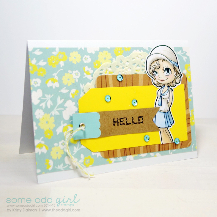
Happy Monday!
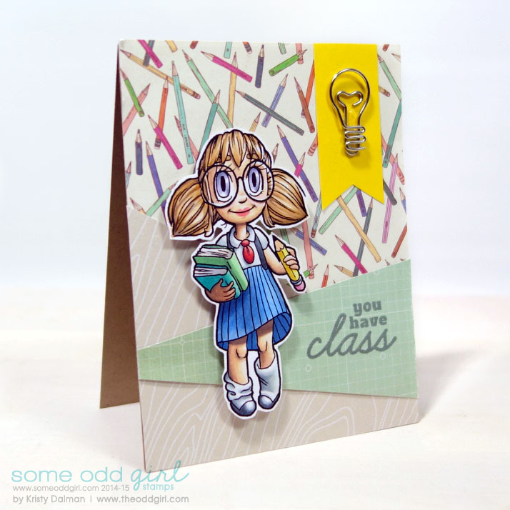
Today I’m sharing with you this card using the 1920s Gwen digi stamp and a light soft palette… except that pop of yellow.
I kept the colors and shading very soft on her with my Copics to go with the sweet papers.
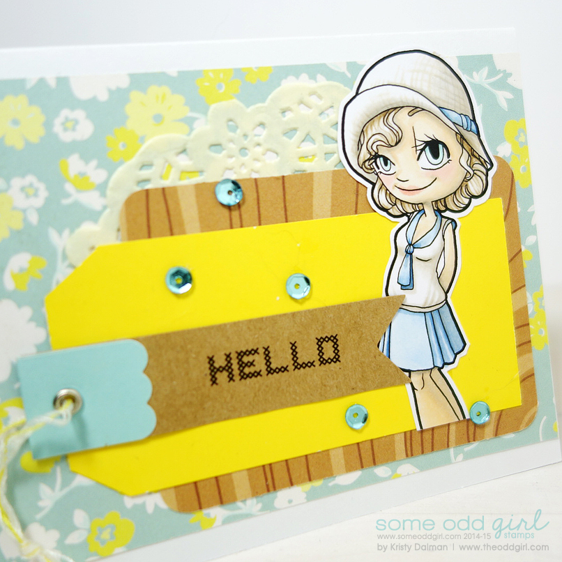
I’ve had this card sitting for a while but I couldn’t get a great pic of it, it just wasn’t cooperating. Lately I had been shooting my pics on a wood top with a pattern paper background because how I used to do it made the editing take a long time. I wasn’t very in love with it. So many make it look FAB but I wasn’t pulling it off well. I was reading this post by Making Nice in the Midwest which got me thinking about:
How I used to light/photograph my items
How much I missed my white background and loved hers
So I white washed my block and am still working on the rest but as a first go this is much improved for me! I barely had to edit it, more just resizing, and it looks fab. Once I’m totes happy with it I’ll share what I changed, I have a few things in mind to make it easier on me.







Anna Sigga says:
Love this card – so soft and that pop of yellow is fab!